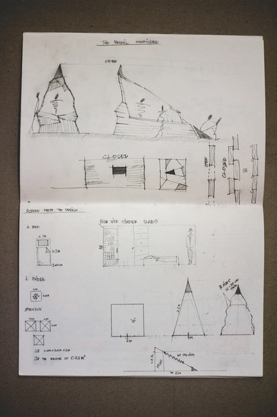
After putting a fair amount of thought in to, how could each of the design ideas evolve, what could they fit in themselves, and what could they mean, I chose to develop the idea of the pencil.I thought of a structure of two forms. One a pyramid, open, a display itself, would allow the salesman to move from one side of the shape to the other, communicating, and the sloped sides of it would be a shelf for the products, as well as a resting spot. The timber slabs could be drawn and painted on, pined up on, becoming a celebration of time, maybe, a piece of art itself. Second form of this structure would be a rectangle. Closed up to the outside, calm, allowing rest. Simple and optimal in space, it would allow minimal use of material to achieve maximal size. I started to figure out, what should be the dimensions of the shape and what timber slabs they could be made out of.
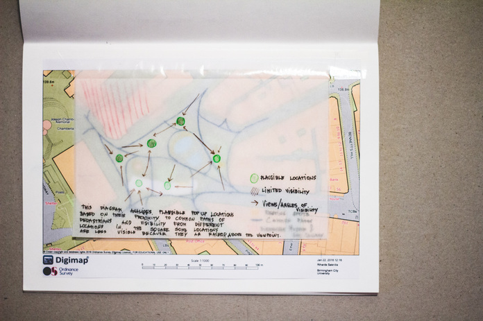
As a part of trying to understand the form and function of this concept, I analysed the site, Victoria Square. I thought of how people move through it, where they can sit down, to rest, I thought about interest point near by and which plausible locations would be better visible from all angles. I put the pop-up location options near bigger junctions of routes people take and resting points. The most successful location for my pop-up would be near these routes, but not in the way of them. An arts supply shop is a subtle experience, I fell like it should have a certain amount of intimacy. It does not need to scream, advertise it self, it just needs to be there.